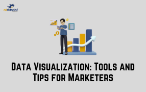
Data Visualization: Tools and Tips for Marketers
In today’s digital-first world, marketers handle a tremendous amount of data—from website traffic and social media engagement to campaign performance metrics. However, raw data alone isn’t very helpful unless it’s presented in a way that’s easy to understand and act upon. That’s where data visualization comes into play.
What is Data Visualization?
Data visualization is the practice of representing data in graphical formats like charts, graphs, maps, and dashboards. It turns complex data into visuals that highlight trends, patterns, and insights, making it easier to make informed marketing decisions.
Why is Data Visualization Important for Marketers?
-
Simplifies complex data: Visuals make it easier to digest and explain.
-
Enhances communication: Teams and stakeholders can understand data better through visuals.
-
Supports better decisions: Spot trends, patterns, and outliers quickly.
-
Improves reporting: Beautiful visuals make client and team reports more impactful.
Top Data Visualization Tools for Marketers
Here are some beginner-friendly tools that marketers can use to visualize data effectively:
1. Google Data Studio
-
Free and easy to use.
-
Connects with Google Analytics, Google Ads, and more.
-
Great for creating interactive dashboards.
2. Canva
-
Ideal for creating infographics and social media visuals.
-
Drag-and-drop design makes it easy, even for non-designers.
-
Offers pre-built templates and icons.
3. Tableau Public
-
A powerful tool with advanced visualization options.
-
Good for creating interactive and shareable dashboards.
-
Requires a bit of learning curve but worth it for in-depth analysis.
4. Microsoft Power BI
-
Integrates well with Excel and other Microsoft products.
-
Best for companies already using Microsoft tools.
-
Offers both desktop and cloud versions.
5. ChartBlocks
-
Simple and beginner-friendly.
-
Lets you build charts from scratch or import data.
-
Can be embedded in websites or shared on social media.
Tips for Effective Data Visualization in Marketing
-
Know your audience: Tailor your visuals to what your stakeholders care about.
-
Choose the right chart type: Use bar charts for comparisons, line charts for trends, and pie charts for proportions.
-
Keep it clean and simple: Avoid clutter. Focus on one message per visual.
-
Use colors wisely: Stick to brand colors and use contrast to highlight important data.
-
Tell a story: Every chart should answer a question or support a decision.
Conclusion
Data visualization is not just about making pretty charts—it’s about making smarter marketing decisions. Whether you’re a solo digital marketer or part of a big agency team, using the right tools and strategies can transform your data into a powerful asset. If you're looking to enhance your marketing efforts through expert analytics and cutting-edge data techniques, connect with the best digital marketing agency in Dubai to take your strategy to the next level.